React Navigation: Shared element transition 1/3 (overview)
This is a series of posts about how to create custom transition “views” using the Transitioner in React Navigation (based on “NavigationExperiemental”):
- An overview of Transitioner and CardStack
- Simple transitions: cross fade and Android default
- Shared element transition 1/3: overview (this post)
- Shared element transition 2/3: bounding boxes
- Shared element transition 3/3: the animation
In the last couple of posts, we’ve learned about how Transitioner/CardStack works and how to create simple transitions by interpolating AnimatedValues that the Transitioner creates. Now, let’s try something fancier - shared element transition:
This neat transition was inspired by the example in the Material design guideline. We’ll look at an initial implementation which, of course, leaves plenty of room for improvements. And there might be much better approaches. But I think the main points learned via this excise should be useful elsewhere. If you prefer, feel free to dive into the source code, play with it and come back as needed.
Goals
Taking on it as a personal challenge, I set the following goals before coding:
- Pure JavaScript: Because Pure JS is good.
-
Minimal API: We’re gonna need a way to tell which views are shared and how they are linked. I wanted to minimize user’s effort for doing so.
- Reasonably smooth on older devices: Of course 60 FPS is the ultimate goal we should all aim at. But realistically it’s hard to achieve on older devices with pure JavaScript. The default CardStack animation sports about 40 FPS on my Nexus 5, which looks reasonably smooth and usable. Let’s use this as a yardstick and see how much further we can improve the performance.
Dissecting the animation
OK, it’s now time to look closely at the animation that we want to create. There are a number of things happening during the 300ms transition window:
- The entire photo grid scene first darkens gradually.
- The photo thumbnail in the grid is lifted up slightly (by casing a shadow).
- The thumbnail then moves, zooms and eventually becomes the bigger photo in the detail scene.
- Along with the photo, its container moves and grows until it fills up the screen.
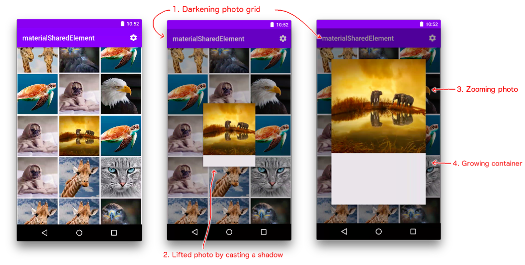
The most interesting part is the No.3 above which creates an effect that the photo jumps out of the grid and expands itself into the detail scene. We’ll devote most of this post to how it works.
Smoke and mirrors
Do you really believe that there is a single image being shared between the grid and detail screens?
Let’s reveal the magic trick! The truth: nothing is shared and there is still a separate image on each scene. Most of the animation happens on an extra overlay visible only during the transition. BTW: It’s in fact very difficult, if not impossible, to share a view across different parts in a component hierarchy in React.
It goes like this:
- When the transition is about to start: We show the overlay and clone the shared views onto the overlay. The detail scene is rendered but invisible, allowing us to calculate the bounding boxes of the shared views on both of the grid and the detail scenes.
- During the transition: Using the aforementioned bounding boxes, we animate the cloned views on the overlay.
- Right after the transition: We hide the overlay and show the actual detail scene.
Sounds straightforward to implement, right? I thought so in the beginning, however, I had to go through a few iterations to do it properly in the React way, and the asynchronous nature of React Native presents some unique challenges.
Let’s just start coding and see how far we could go.
The render* methods
Still remember how to use Transitioner? Our SharedElementsTransitioner just renders to a Transitioner and defines its _render function like so:
class SharedElementsTransitioner extends Component {
  ....
  render() {
    return (
      <Transitioner
        render={this._render.bind(this)}
        ....
      />
    );
  }
  _render(....) {
    const scenes = props.scenes.map(scene => this._renderScene({ ...props, scene }));
    const overlay = this._renderOverlay(props, prevProps);
    return (
        <View style={styles.scenes}>
            {scenes}
            {overlay}
        </View>
    );
  }
}_
The _render function is almost the same as that of CardStack except for the additional overlay where most of the animations take place.
The _renderOverlay function should be straightforward too. We just render all the shared views there:
// class SharedElementsTransitioner
 _renderOverlay(....) {
   const sharedViews = this.cloneAndAnimateSharedViews(....);
   ....
   return (
     <Animated.View style={overlayStyle}>
       {sharedViews}
     </Animated.View>
   );
 }_
We’ll leave the discussion about this cloneAndAnimateSharedViews method to the next post (as it’s a long discussion).
Creating animated styles for scenes and overlay
In order to ensure the overlay to be visible only during transition, we can use the “0.99-cliff” trick discussed in the previous post:
// in _renderOverlay()    //_
  const left = transitionProps.progress.interpolate({
    inputRange:  [0, 0.99, 1],
    outputRange: [0, 0,    100000], // move it off screen after transition is done
  });
  const overlayStyle = { left };
Here we chose to animate left instead of opacity to prevent the overlay from blocking touch events.
Similarly, we apply the “0.99-cliff” treatment to scene opacity in _renderScene to make sure that the detail scene is initially invisible and only becomes fully opaque when the transition is about to finish. Contrary to the detail scene, the grid scene remains visible during the transition and only becomes invisible right after.
// class SharedElementsTransitioner
_renderScene(props) {
  const { position, scene, progress } = props;
  const { index } = scene;
  const opacity = position.interpolate({
    inputRange: [index-1, index-0.01, index, index+0.99, index+1],
    outputRange:[0,       0,          1,     1,          0],
  });
  const style = { opacity };
  return (
    <Animated.View style={[style, styles.scene]}>
      ....
    </Animated.View>
  )
}_
Conclusion
OK, let’s take a break for now. We have discussed a high-level plan on how the shared element transition might work: the overlay is the key to create the shared element effect. We also covered some simpler aspects in its implementation: the render* methods, and how to show/hide scenes and the overlay at the right times.
In the next post, we’ll look into how to actually animate the shared views on the overlay. Bear with me, the fun is still ahead!
